
“Engage” Design System — Case Study
Emgage
“Engage” Design System
How I took a large scale design system from 0 to 1 and beyond.
Introduction
“Engage” is the comprehensive internal design system and component library used by the designers and engineers at Emgage—a toolkit for building high-quality, consistent, accessible products at scale. It also serves as the foundation of the Emgage App Platform, an all-in-one PaaS ecosystem for building enterprise-grade business solutions.
As the Founding Product Designer, I led the creation, adoption, and ongoing evolution of the Engage design system, shaping a system that ensured product consistency and coherence from design to delivery, while also accelerating timelines and enabling designers and engineers to move faster and build better at scale.
Highlights
2x FasterDev Cycles
100%Consistent UI
Baked InAccessibility
100%Themeable
80+Components
My Role
🎨 Founding Product Designer
🧩 Design System Lead
Key Expertise
Strategic Planning
Systems Thinking
Cross-Functional Collaboration
Accessibility
Tools
Figma, React,
Github, Azure, npm
Retired Tools
Sketch, Zeplin, Storybook
Context
Shaping a large-scale product within a ground-level startup was a thrilling experience, filled with unique challenges and opportunities to learn, lead, and give design a seat at the table. Crafting the Engage design system was one of those opportunities.
As Emgage’s first design hire, I collaborated closely with the lead engineer to build Emgage’s extensive design system (initially in Sketch, later migrated to Figma) and component library (React) from the ground up, equipping our design and engineering teams to design, communicate, and build more effectively at scale.
Solution
Introducing the "Engage" Design System, a full-featured system consisting of:
- Design component library (Figma) and supporting ecosystem.
- Engineering component library (React) with supporting DevOps tools and practices.
- Component specifications, behaviors, and guidelines.
As a testament to its success, the design system has reliably supported the Emgage App Platform and numerous client-built applications, handleing large-scale changes—including a complete re-work of the input validation experience.
How I got there
The messy stuff.
Building a Design System from scratch
How I took the Engage Design System from 0 to 1 and beyond.
Process Overview
1
Research
Deciding the systems and tools necessary to set a large-scale product on the path to success.
2
Foundations
Defining the visual and structural building blocks of the design system.
3
Components + Adoption
Creating the component libraries and docs necessary to equip our designers and engineers to design, communicate, and build at scale.
4
Evolution
Continuously refining and evolving the design system to meet current needs, adapt new capabilities, and overcome points of friction.
Research
Establishing the foundation of a large-scale product has to be one of the most consequential challenges a designer or engineer will face, with inherent complexities, risks, and unknowns all amplified by scale.
I knew appropriate systems and tools needed to be put in place to manage this complexity; however, I did not have clarity as to which. So, I partnered with our lead engineer, and together we started researching. We read articles, studied guidelines created by industry-leaders, and learned from what others were doing who faced similar challenges.
The research paid off, guiding us in defining the systems, tools, and processes upon which the Emgage App Platform would be built. Below are a few key decisions we made related to the design system:
Key Decisions
1
We decided to build our application using React with TypeScript. React due to its performance and component-driven architecture. TypeScript due to the enhanced readability and maintainability of strongly typed code at scale. With Angular in the lead at the time, this may not have been the popular choice but turned out to be the right decision.
2
We chose to develop our own component library. This discussion was twofold. First, this was in the early days of React, and mature open-source design systems did not exist yet. Second, while contributing to an existing "beta" library may have given us an initial jump start, we knew the lack of control over merge approvals could ultimately slow us down.
3
We embraced SCSS with CSS Modules, enabling us to create powerful, sensible, component-scoped styling without headaches or conflicts.
4
We selected React CSS Themr for easy theming when using CSS Modules.
Foundations
Foundations define the visual and structural building blocks that give a design system professional polish, creating a cohesive framework where every component and interface fits together seamlessly.
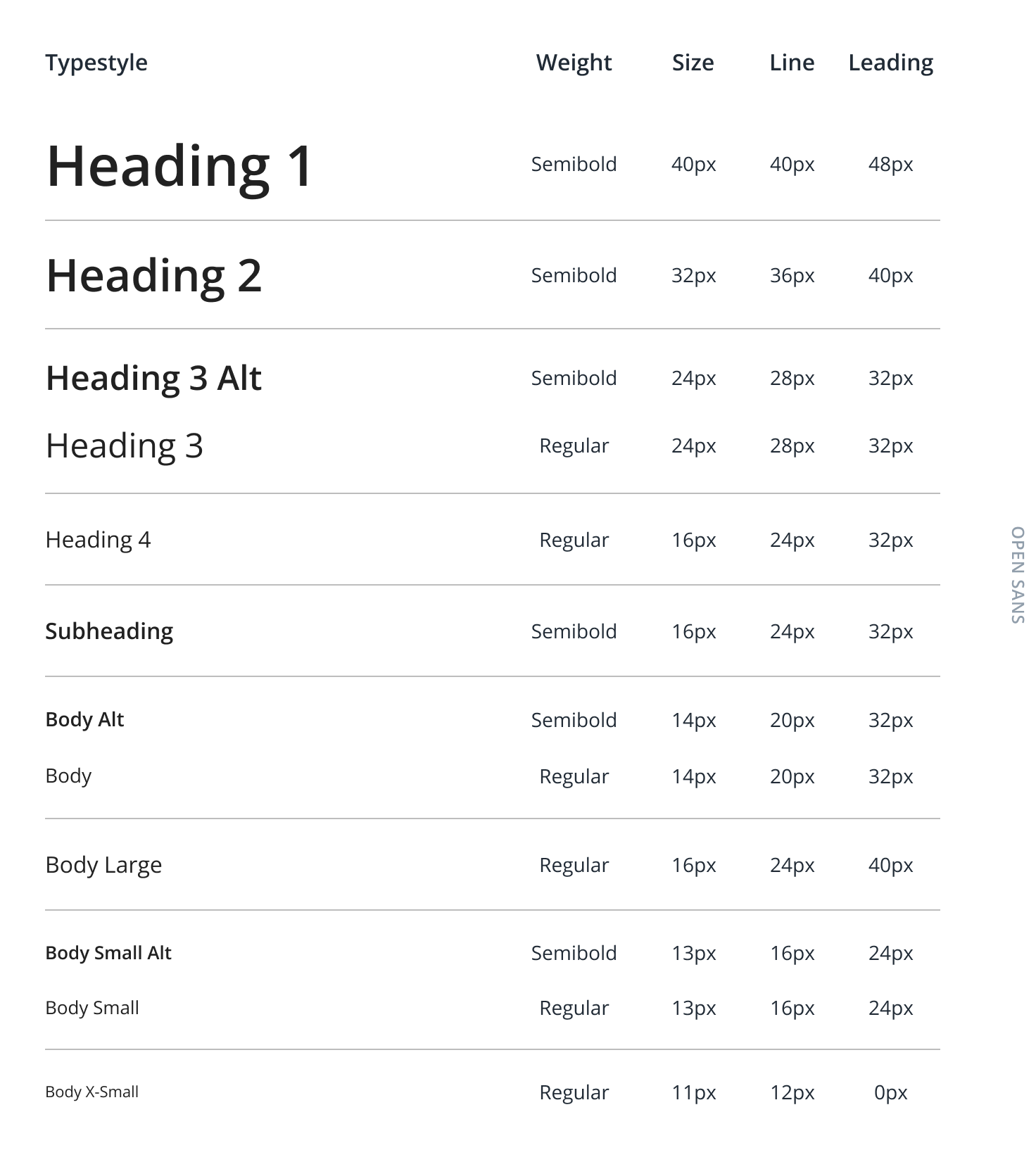
Typography
The 4px base unit was also applied to typography, ensuring line heights and spacing aligned with the rhythm of the rest of the UI.
Typography styles and hierarchies were incorporated into the design system, and three type-related React components were developed to enforce consistent application across the platform. Beyond consistency, this approach provided a simple way to scale type throughout the application and quickly implement fixes.
For example, when we discovered that one of the colors in our type palette did not meet WCAG 2.1 Level AA contrast guidelines for accessibility, all it took to resolve the issue across the entire application was a single adjustment. Because I used generic descriptors for the palette—such as Darkest, Dark, Mid, and Reverse—the change was effectively transparent.
Spatial System
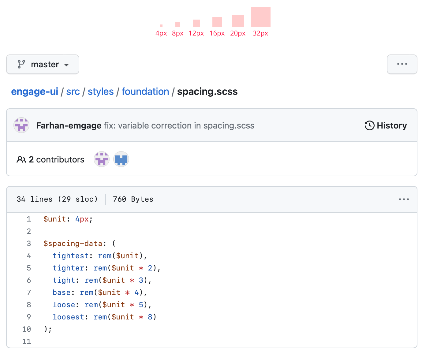
Spatial systems, such as spacing scales, grids, and layout rules, provide the consistent rhythm and constraints necessary to create a professional, cohesive visual interface.
I chose a 4px base unit and built an SCSS variant-based spacing system for use across all system components. While slightly cumbersome—our engineers took some time to adapt to using the spacing variants instead of static px values—the approach provided a simple, uniform way to define and scale spacing across the app.
This flexibility proved especially valuable as larger, high-pixel-density screens became more common, and our original interface spacing norms began to feel outdated.
Colors
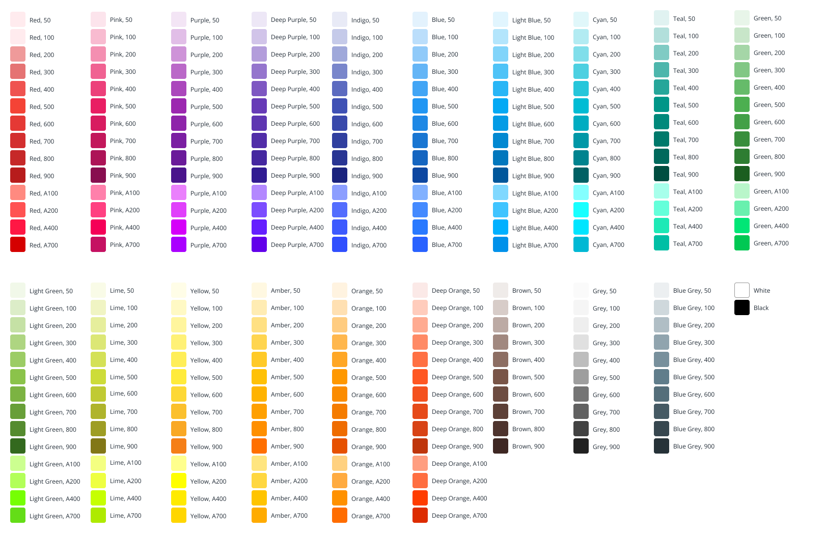
Initially, I created a limited, system-specific color palette, consisting of just a few colors and their tints. As the platform grew and more complex visual elements—such as data visualization widgets—were added, it became clear that a more comprehensive palette was needed. In response, I adopted the Material UI palette, which our theming architecture handled beautifully.
Component Library
With the foundation of the design system in place, I was able to move on to creating the components that would serve as the building blocks for the Emgage App Platform application.
Having started work on many of the app interfaces, I already had the beginnings of a design component library and a solid understanding of which code components to prioritize. Desiring not to hinder our engineering team's efficiency, I did what I could to devote my focus to the React component library, composing specs and working hand-in-hand with our front-end engineers to create the necessary components.
Initially, I held a very hands-on role in the development of each React component—determining composition, defining props, developing render markup, generation styling, and ensuring component accessibility. As the team grew, I was able to delegate much of this to a UI engineer I had hired and trained.
I created decision trees for cases where component usage relied on specific patterns or rules. These proved extremely helpful in ensuring a consistent user experience.
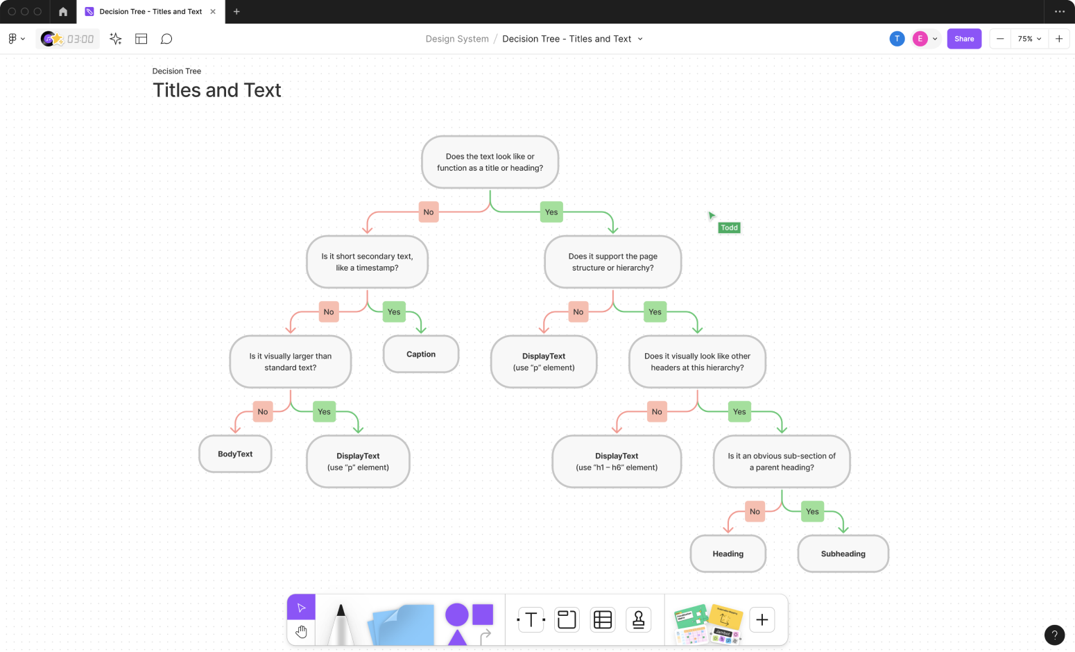
Title and Text components decision tree
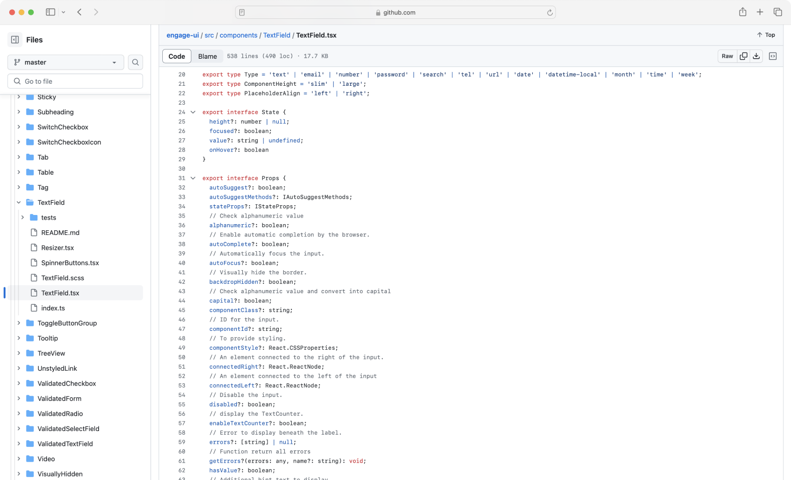
TextField component - React
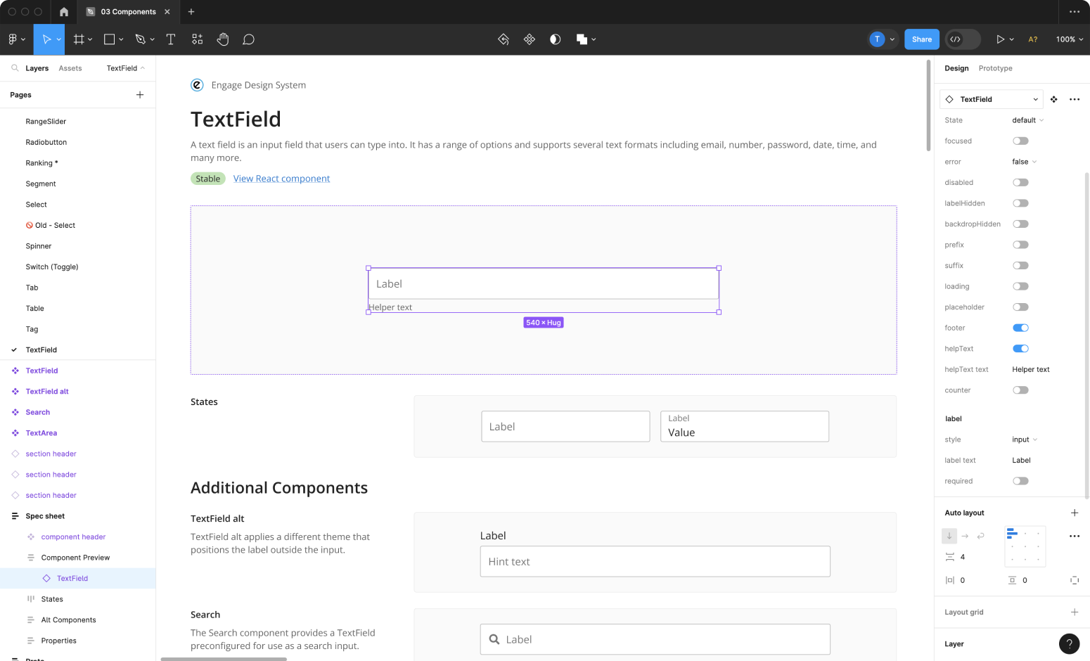
TextField component - Figma
Modular
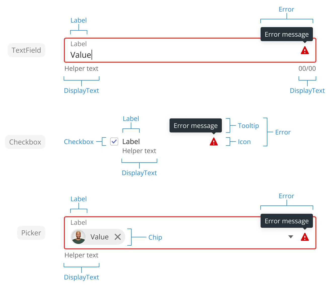
A key to the design system's success is the way it adopts software design patterns and best practices such as modularity, composition, and single responsibility in its construction.
Each component has been created to solve a specific need, with elements and functionality shared between multiple components abstracted into unique sub-components.
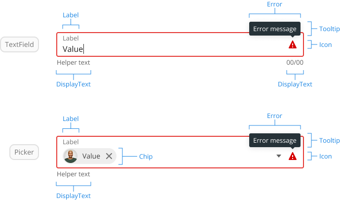
Consider the label, for example. Every input has a label. While a label will never exist on its own, it is reused in the composition of numerous components, such as the text field, checkbox, and picker. Abstracting the label into its own component creates consistency and eases maintenance. The same applies to other elements and functionality, such as validation, errors, overlay positioning, and loading indicators.
This modular approach of abstracting what's shared ensures consistency, eases maintenance, and provides a toolkit of building blocks for future components.
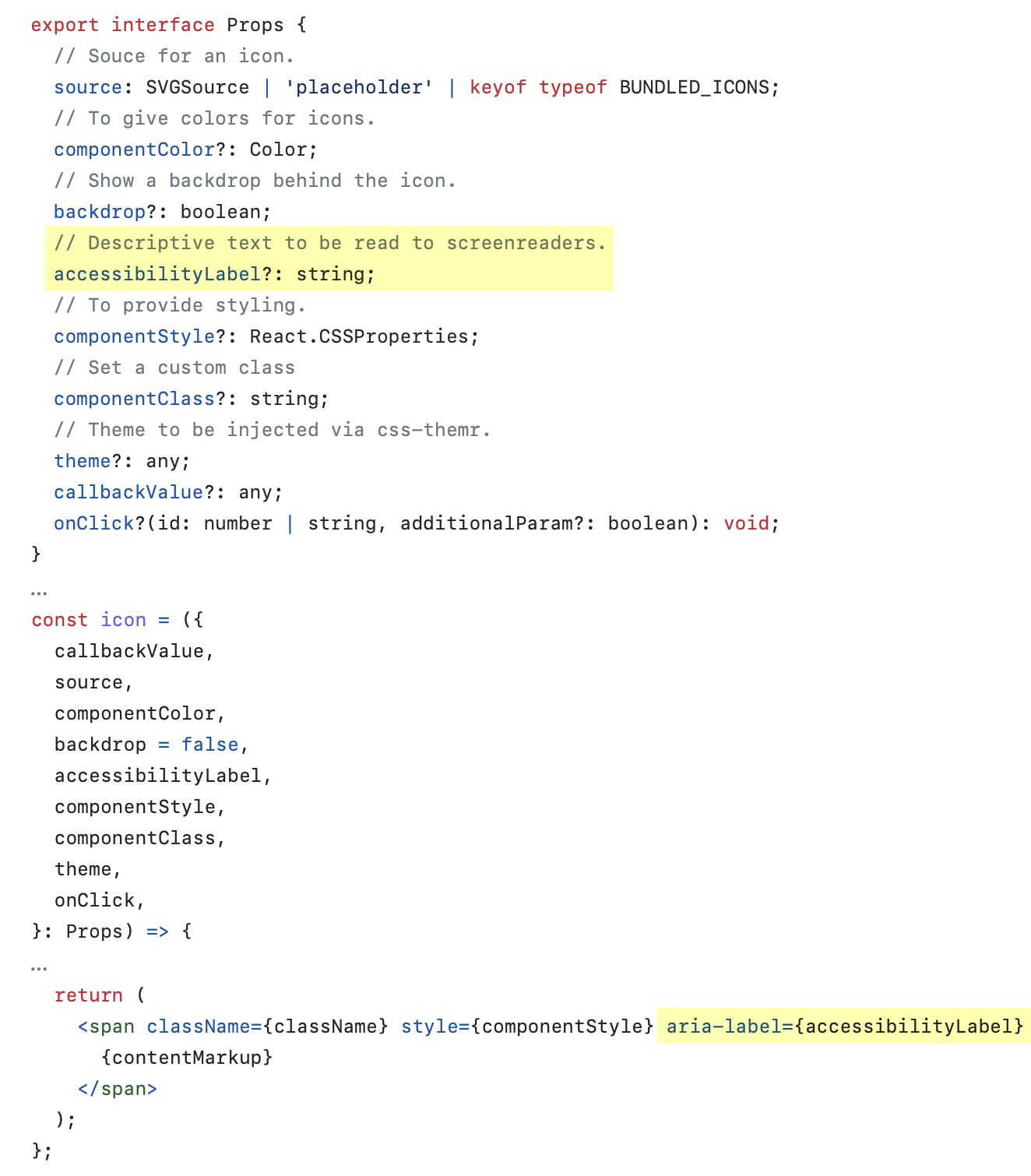
Accessible
"Disability is part of being human," says the World Health Organization, with most everyone experiencing temporary or situational disability at some point in their life.
In my opinion, there is no excuse for not baking accessibility into your development process, with several great tools and resources available that simplify both testing and issue remediation.
As design system components were developed, they were tested for accessibility. I initially performed this testing, sharing best practices and fixes with our engineers as we went along. As the team grew, I was able to train our UI engineer to conduct this testing, resolve issues, and work alongside our front-end development team to ensure component accessibility.
Benefits
A few key benefits of the design system:
Key Personas

Accelerated Design and Development Cycles
The design system allowed teams to quickly select and configure premade components without needing to reinvent the wheel, codifying design decisions and patterns that could quickly be replicated at scale.

Consistency
The design system provided a single source of components, patterns, and styles for use throughout products, delivering a familiar, intuitive experience that enhanced overall product usability.
Better Code and Design Quality
Building for reuse (instead of a one-off) intrinsically leads to better quality. The wide use inherent to design system components meant they had been well reviewed and tested, with any shortcomings surfaced and resolved.
Better Knowledge Sharing
The design systems provided a shared language between designers and engineers, promoting knowledge transfer and eliminating waste created by miscommunication.
Maintainability
The centralized nature of the design system meant fixes and improvements were made in just one location and automatically propagated throughout the product.
Built-in Accessibility
A design system with accessibility prioritized from the start sets products on the right path, giving engineers the tools they need for building accessible products.
More Flexibility
Counterintuitively, the design system offered greater flexibility in exploring and evaluating ideas by reducing the effort required to create and revise mockups and prototypes.
Challenges
Overall, creating a scalable design system from the ground up was a rewarding experience. However, it was not without challenges, of which I'd like to share a couple.
Avoiding breaking changes
Design systems are living entities that continuously change and evolve. This dynamic nature led to one of my biggest challenges—learning how to update a Figma component without introducing breaking changes.
Learning more about what triggered these breaking changes and implementing some cool tricks I learned from a speakers at Figma's Config conferences helped me avoid breaking overrides. However, I must confess, I still cringe a bit when clicking "Update" on files I have not opened for a while.
Teaching engineers and designers new tricks
Much of our team did not have experience working with a design system, considering accessibility, or working on a large-scale application. This meant keeping a lookout for bad practices and regularly engaging with teammates to provide guidance, advice, and training surrounding design systems, accessibility, and component-based development. Most of the team welcomed the opportunity to learn and grow, making this challenge enjoyable and rewarding. However, a few were not as eager, creating a particular challenge.
Using the Engage Design System, I crafted the following experiences for the Emgage App Platform:
- Data: Relational data creation, management and governance, item and field templates, faceted search and discovery.
- Interfaces: An intuitive, visual builder for creating custom forms and pages.
- Workflow: Innovative process automation with powerful conditions, triggers, connections, and automatic interface generation.
- Templates: Pre-built, customizable templates to kick-start projects and shorten timelines.
- Messaging: Data-driven digital communication across email, SMS, and in-app channels.
- Agreements: Frictionless document creation, templating, and e-signatures, all seamlessly integrated with our customer's data and workflows.
- User Management: User management, provisioning, groups, and roles.
- Authorization: Granular permission and policy creation, entity and field level authorization, intuitive management of direct and inherited policies.